IDEAS
Branding
Our process is aimed to engage, inform and enlighten target audiences. We believe brands should be strong and distinct.
Patrick Gardner
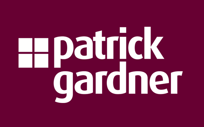
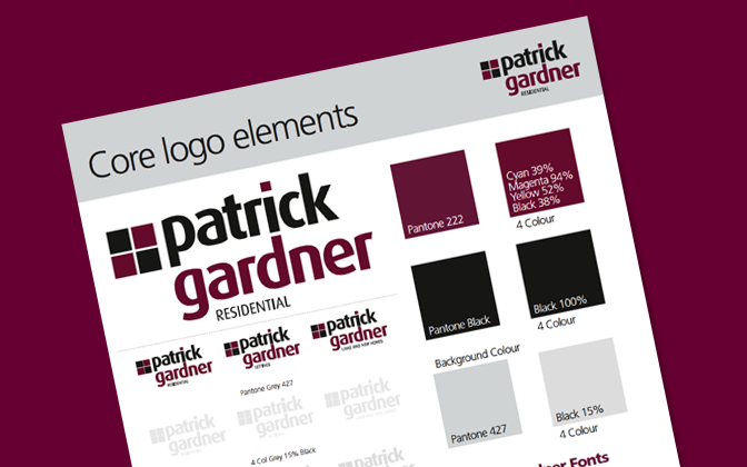
Patrick Gardner Logo: The challenge was to update a very old logo and create a modern one that would be noticed and easily recognisable across all media and especially on sale boards, using the existing corporate colours and font.
Rosebery Housing Association
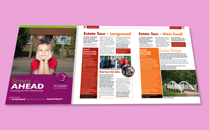
Streets Ahead: Brief – to design within the corporate guidelines an informative and attractive newsletter for residents promoting the activities of the housing association and various community groups, encouraging and welcoming residents to take part in activities and interact more.
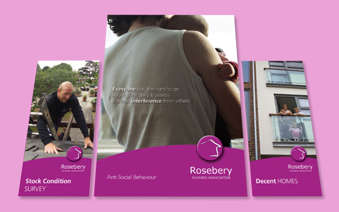
Leaflets & Brochures: Brief – to produce an attractive, uniform and easily understood series of publications informing residents of the important issues and developments affecting them. To provide them with helpful and useful information in plain English.
Paxton and Whitfield
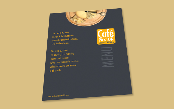
Café Paxton Menu: Brief – For this new venture of Paxton & Whitfield’s first café in the UK the client desired a subtle departure form their traditional identity as a premiere cheese vendor. We produced a classy and stylish menu in the corporate colours in a sympathetic design acknowledging Paxton & Whitfield’s cheese purveying heritage.
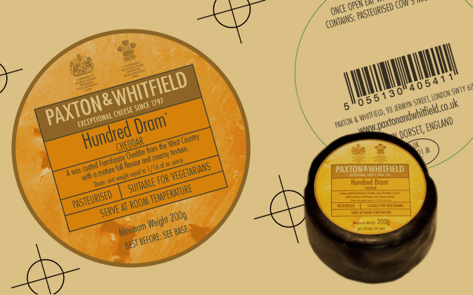

Paxton product packaging: Brief – to produce a variety of distinctive packages for different produce for this triple Royal warranted client. All designs had to adhere strictly to very rigid, historic corporate guidelines. The Hundred Dram cheese is one of Paxton & Whitfield’s classic and best selling lines, the design altering only very slightly over time. We therefore had to carefully respect all the historical associations with the particular branding.
Surrey Downs Golf Club
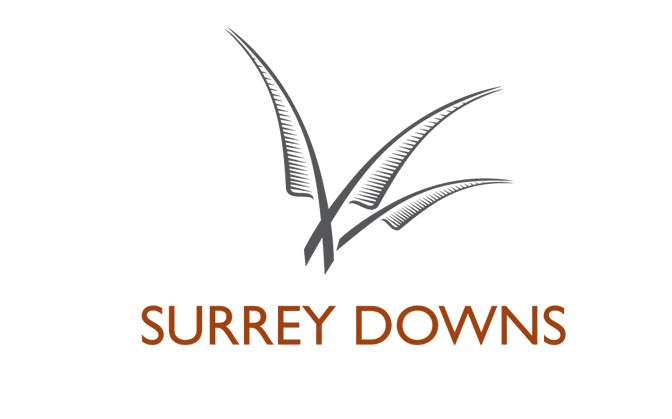
Surrey Downs logo: Brief – Surrey Downs Golf Club was a new venture to build a premiere Golf Clubs in Surrey on previously unused land. As such we were commissioned to design a new corporate identity & logo. The logo chosen was from the feathers of the skylark a common sight over the fields and now greens on the site.
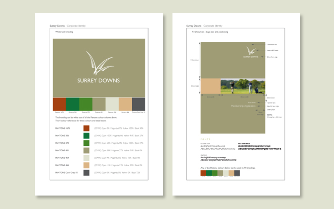
Surrey Downs Corporate Guidelines: Brief – to produce a set of corporate guidelines that would mirror and be sympathetic to the club’s outstandingly beautiful, natural setting. The guidelines produced had a colour palette, painstakingly researched to mirror the indigenous nature and colours in and around the surroundings of the club on the Surrey Downs.
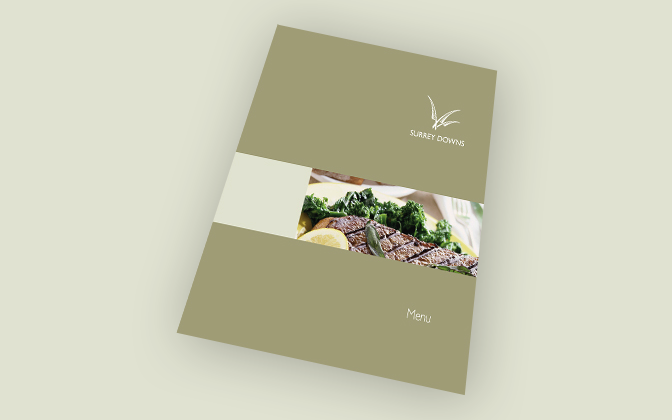
Surrey Downs Inserts and Menu: Brief – To produce a classic and classy set of matching literature to reflect the prestigious nature and standing of the club to market it as a venue for events, its function rooms and restaurant.
Surrey Women’s Aid
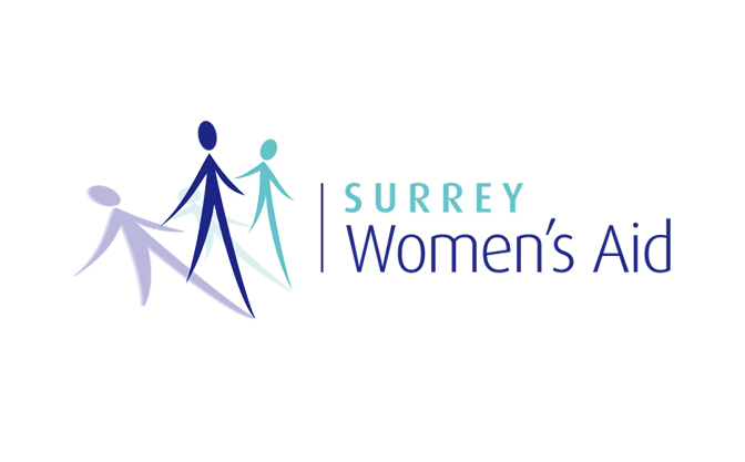
Surrey Women's Aid logo: Brief – To produce a distinct and easily recognisable identity for this women’s charity. It had to portray strength, helpfulness and vulnerability. This was achieved by producing two figures in distinct poses with their respective shadows.
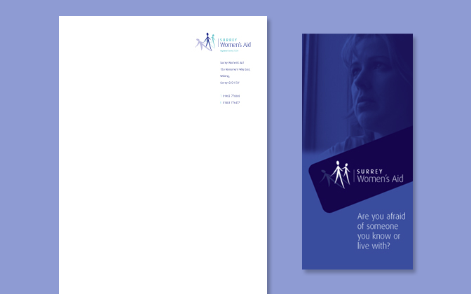
Surrey Women's Aid Stationary and Leaflets: Brief – To produce informative literature in keeping with the charity’s ethos whilst also keeping costs to a minimum. The use of 2 colours and distinctive imagery managed to achieve the desired results.
The LifeFit Organisation Limited
The LifeFit Organisation Limited Logo: We were briefed to produce a new corporate identity for this fitness organisation, develop all print marketing materials and a new website.